Inveralmond:
Rebranding one of the most successful and respected breweries in Scotland.
The rebrand was intended to revitalise consumer perception and better represent the quality and origin of the brewery and products. The Inveralmond team felt that unification was needed across the core range and their annually - changing product and wanted to take the opportunity of a rebrand to project the authenticity of the brewery and its values.
Project summary
Design & Strategy
Corporate identity / Packaging
Approach
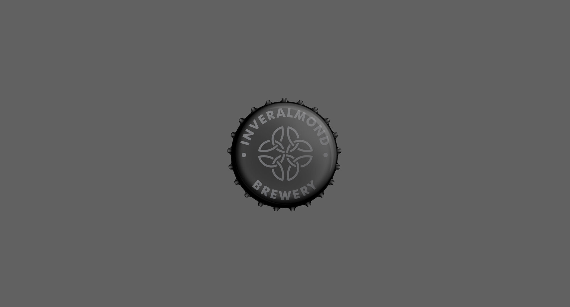
The brand marque was recreated to respectfully update and modernise the logo without abandoning its origin, showing regard for the brewery's history and loyal followers.
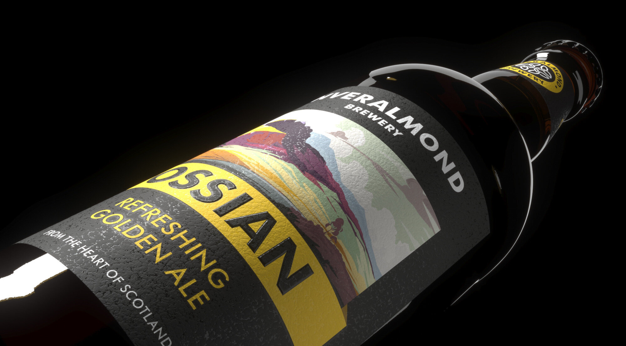
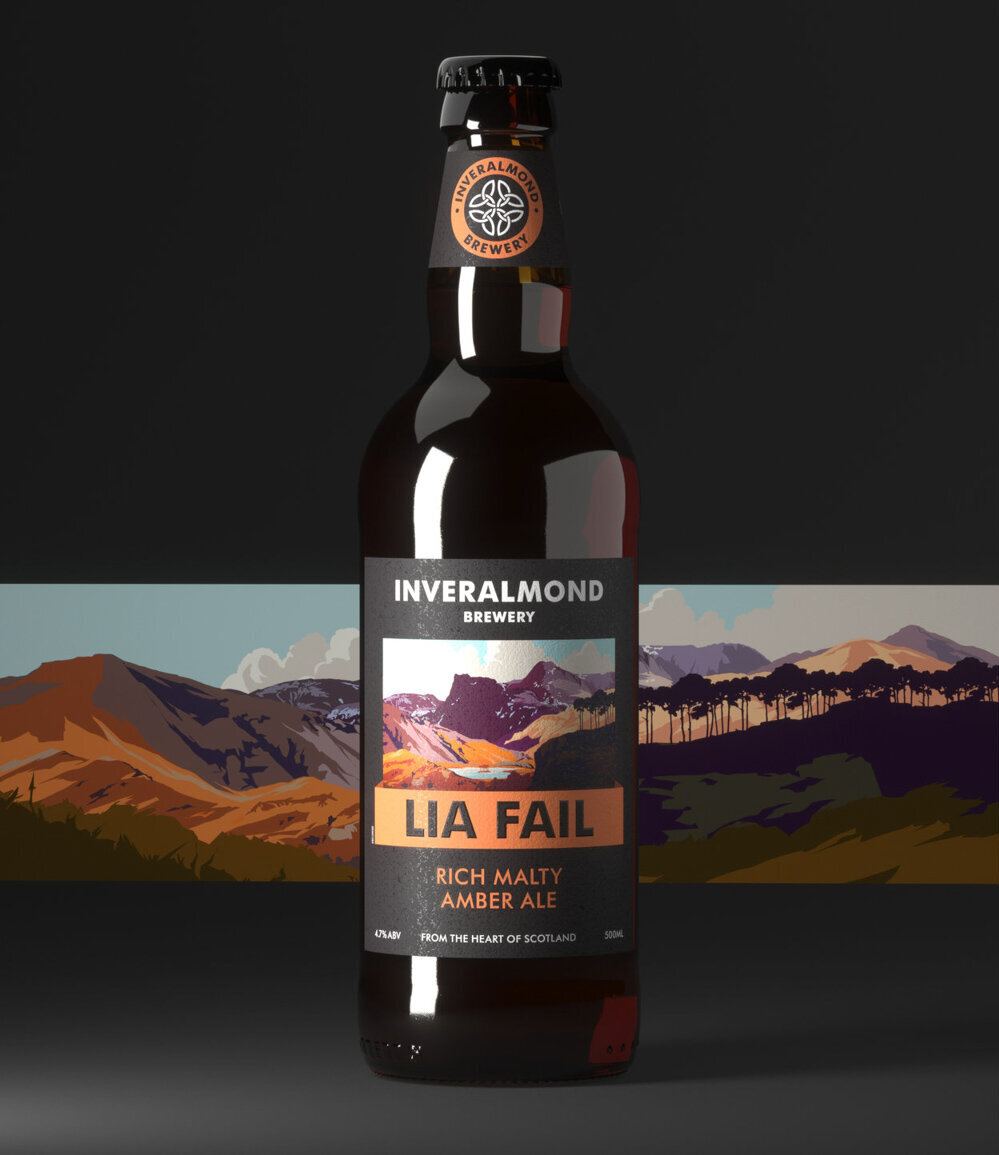
The modern romantic style of artist Peter McDermott, based in Skye, was selected. The aim was to tap into the image and nostalgia that Scotland globally provokes; that of landscape, beauty and rich history. He was commissioned to create bespoke illustrations for each of the core range, creating an immediately recognisable sense of place and old-world charm.
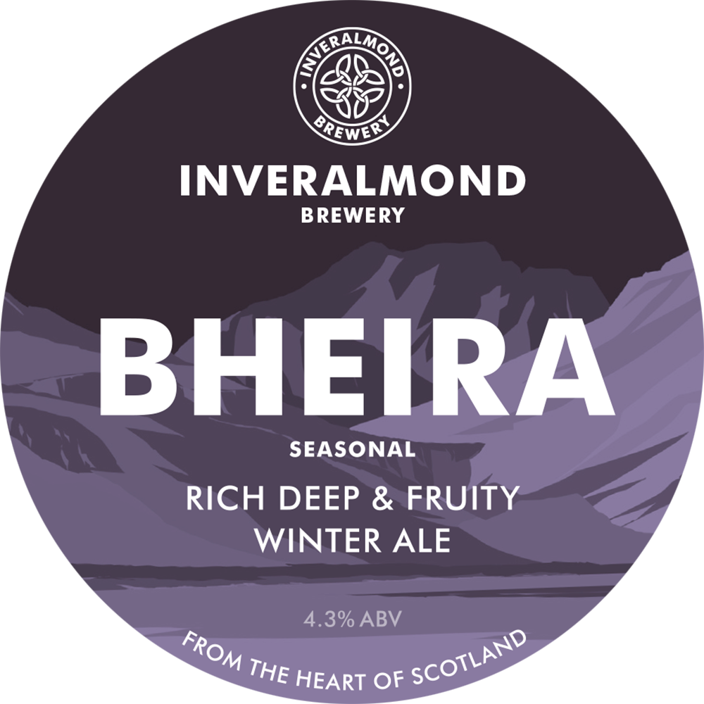
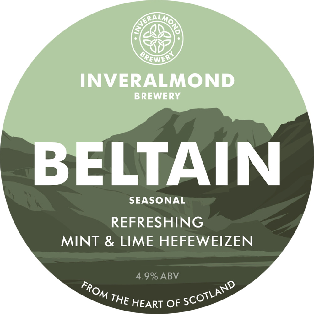
Alongside the core range of beers, the new identity was applied to the breweries seasonal lineup. A generic background illustration is used with bespoke colours for each beer, making the seasonal range appear less formal whilst still part of the Inveralmond family.
Project team
Illustration: Peter McDermott
3D visualisations: Render Studio
Client comments
"On the back of our ongoing success of Ossian and Lia Fail and interest in our seasonal range as they appear, we felt a rebrand that would more effectively represent our provenance would modernise Inverlamond for the ever-changing craft-beer market.
Freytag Anderson have successfully re-imagininged the range, allowing us to look forward with the business while celebrating our origins and passion for authentic brewing. "
Aly Bayne
Marketing Manager, Inveralmond Brewery

